Warm White, Multicolor or Color Changing: Picking a Look That Suits Your House
Lit Up Taylor's Way • September 18, 2026 • 7 min read
Color is the decision people want to make first and the one a designer will gently make last. Structure comes before palette: which lines get lit, which trees, whether the roofline leads or a tree does. Once that is settled, the color question usually answers itself. But it still has to be answered, and it is worth understanding the options properly before you do.
There are three broad families, and they behave very differently on a house.
Warm white
This is the soft, slightly golden white of an incandescent bulb, and it is what most professional displays are built on. It flatters nearly every material: red brick, tan brick, dark siding, painted wood, white trim. It matches the color of the light already coming out of your windows and porch fixtures, so the display and the house feel like one thing rather than two.
From the road, warm white reads as calm and expensive. It is the color you choose when you want the house to look its best rather than the lights to look their busiest. If you are unsure, it is the answer. Very few people regret a warm white roofline.
Pure and cool white
Cooler whites are crisper and bluer. They suit modern architecture, gray or white exteriors, metal roofs, and homes with a lot of glass. They photograph brilliantly against snow. On the wrong house they can look clinical, and against warm brick or cedar siding they fight the material rather than lifting it.
The one rule with white is not to mix temperatures on the same surface. A roofline with warm white on one run and cool white on the next looks like a repair, not a design. If you want both, give each its own job: cool white in the trees, warm white on the house, or the other way around.
Multicolor
Red, green, blue, gold, sometimes pink and purple: the traditional palette, and for a lot of families the whole point. Multicolor carries nostalgia in a way white never will, and children love it without reservation.
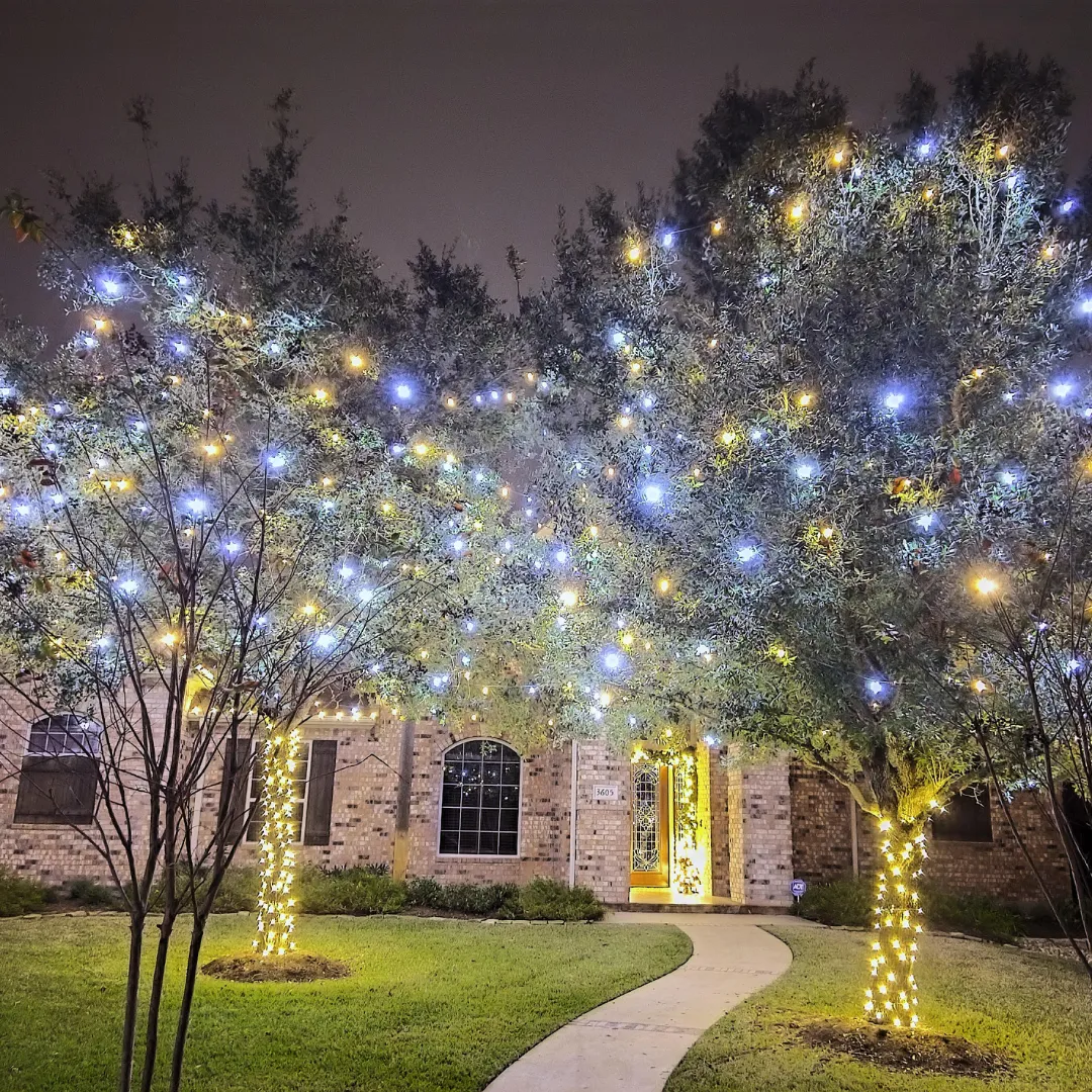
Where it belongs is on trees, shrubs, wreaths and garland. Color in the canopy of a wrapped tree, or along a hedge, or on the evergreens beside the door, looks festive and deliberate. Where it struggles is as a roofline outline on a formal home, where the alternating colors break up the very line the lights are meant to draw. A colonial with a rainbow roofline looks busier than it looks joyful. Keep the structure white and put the color where it can glow.
Within multicolor there is a real choice between a traditional two or three color scheme, usually red and green with white, and the full spectrum. The restrained version reads as classic. The full spectrum reads as fun. Both are legitimate; they are different moods.
Color changing
Programmable color changing lighting lets one installation wear many looks. Warm white through most of December, red and green for Christmas week, a single color for a birthday or a team's game night, and different schemes for other holidays through the year. The color is set from a schedule rather than by changing bulbs.
It suits people who want the display to evolve rather than sit still, and homeowners who want lighting they can use beyond the holidays. It costs more than a fixed color install, and it is a different kind of product. If a color changing display is on your list, raise it at the consultation and we will walk you through what options are available this season and what they would mean for your house.
Washing walls with color
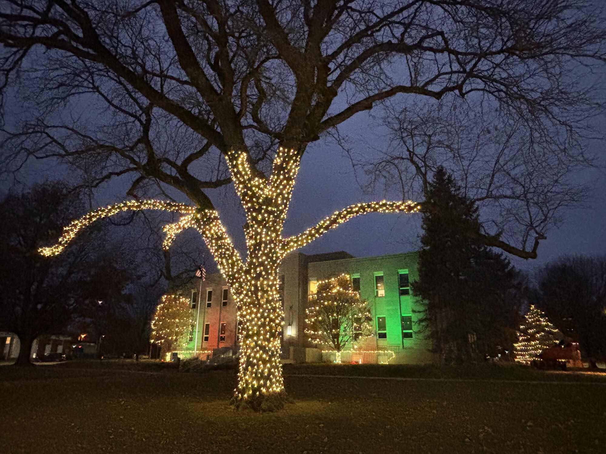
There is a fourth option that is easy to forget because it does not involve strands at all: colored uplighting aimed at the building itself. A brick wall washed in red, an evergreen lit green from below, a column picked out in white. The photograph above is exactly that, a civic building in green and red with a warm white wrapped tree in front of it, and the combination works because each element has one job. The tree draws the eye. The colored walls give it a setting.
Wall washing suits larger buildings, churches, storefronts and homes with a lot of flat masonry, where a roofline outline would be lost against the scale. It also suits people who want color without the busyness of colored bulbs, because a washed wall is one smooth tone rather than hundreds of points. On a house it is usually a supporting move: warm white on the structure, a washed accent wall or a lit evergreen in color beside the entry.
Bulb size changes how color reads
Large traditional bulbs, the kind most people picture on a roofline, put out distinct points of light with space between them. In warm white they read as classic. In multicolor they read as unmistakably festive, which is either the goal or the problem depending on the house. Small mini bulbs pack far more points into the same length and blur into a glow, which is why they are the usual choice for wrapping trees and shrubs, and why multicolor minis on a tree look softer than multicolor large bulbs on an eave.
The practical rule: large bulbs on lines, minis on volumes. Rooflines, gables and porch edges take the big bulb. Trees, hedges, garland and wreaths take the small one. Cross them over and the display starts to look homemade, however good the individual products are.
Let the house choose
Siding color is the single biggest clue.
- Dark siding or dark brick: warm white pops against it and looks rich. Color also shows well because the background is quiet.
- Light or tan brick: warm white blends in beautifully; color should be used sparingly so it does not muddy the brick.
- White or very pale homes: warm white can disappear. Cool white or a deliberate color scheme often reads better.
- Gray, modern, or lots of glass: cool white is the natural fit, with color kept to a single accent if at all.
Architecture is the second clue. Formal homes, colonials and anything symmetrical want restraint. Ranches, farmhouses and homes with a lot of landscaping can carry more color, because there is more ground plane to put it on.
Rules for mixing
If you want more than one color, three habits keep it looking designed rather than accidental. Keep the structure in one white and put color in the trees and beds. Limit yourself to two colors unless you are going deliberately traditional. And repeat whatever accent you choose in more than one place, so a red wreath on the gable is echoed by red in the shrubs below. Repetition is what makes color look intentional.
Think about the street
Your display is seen alongside your neighbors', and contrast is a gift. If the whole block is warm white, a single well placed tree in color will stand out without shouting. If the neighbors have gone full multicolor, a clean warm white roofline looks like the grown up on the street. Neither is a competition; it is just worth knowing what you are sitting next to.
The mistakes we see most
Mixing white temperatures on one surface. Rainbow rooflines on formal houses. Cool white against warm brick. Four or five colors with no repetition. And choosing a color before deciding what to light, so the palette ends up driving the plan instead of finishing it.
How to test before you commit
Bring photos to the consultation. A picture of a display you loved on a drive last December, or one you did not, tells a designer more than a description ever will. It also helps to look at your own house at dusk with the porch light on, because that is the color temperature the display will sit beside every night.
What to Do Next
Decide what you want lit first, then come to color with the house in mind. If you would rather have someone make the call, that is exactly what the consultation is for. It is free, and full service displays start at $899 with installation, a timer set to your schedule, maintenance through the season, and removal and storage in January.
Lit Up Taylor's Way designs, installs, maintains and removes holiday lighting across Princeton, Peru, LaSalle, Ottawa, Mendota, Kewanee, Dixon, Peoria and the surrounding communities. Call 815-875-8231 or request your free consultation through the website.